Friday, 12 March 2010

Twitter Timeline Visualisations

Ever wanted to make scrolling timeline visualisations of tweets?

Here's how.

You will need:

  • The R environment for statistics and graphics (www.r-project.org)
  • The twitteR and brew packages for R
  • Some web space
 I'm using the MIT Simile Timeline widget to do all the hard work. All I need to do is get the tweets into the right format. To do that I wrote a little R program using the twitteR package to access tweets via the search API, and the brew package to reformat into XML. Here's my entire twitline function:

twitline <- function(q,outfile,num=15,...){
require(twitteR)
require(brew)
srch=searchTwitter(q,num=num,...)
brewSrc="

<% for(tweet in srch){ %>\
\"
title=\"<%=screenName(tweet) %>\">
<%=text(tweet) %>

<% } %>

"
brew(text=brewSrc,output=outfile)
}
Now all I do is: twitline("sea otters","twitter.xml",num=100) and I get an XML file in the right format. Read the timeline docs and you'll see that all you need is:

Timeline.loadXML("twitter.xml", function(xml, url) { eventSource.loadXML(xml, url); });
 in the right place in your javascript.

There's a few things need doing here, like scaling the timeline to the events on startup, maybe styling things a bit better, having a way to get more than 100 tweets, linking to twitter.com and so on. Consider it a start.

Also, the grabbing and conversion could easily be done in Python or [IYFPLH]. Even cooler would be on-the-fly updates. Check out the SIMILE docs for more ideas.

Barry

Thursday, 11 March 2010

Fun With OpenLayers and Flot

OpenLayers is a javascript library for doing client-side maps. Flot is a javascript library for doing charts. Put them together and what have you got?

A system for dynamic interactive spatio-temporal graphics. It's something I've wanted to play with for a while, and now I had an excuse. Our meningitis data from Africa is exactly that - counts of meningitis cases in areas in time periods. Eventually we'll be getting it in real time, and predicting epidemics. But for now everything is simulated data.

What I wanted was a map of our country of interest (in this example, Niger). Clicking on the regions of Niger would show a time-series plot of the case count history for those regions. Flot can happily show multiple line charts, show dates on the X-axis, adjust its axes automatically, colour-code it's lines and so on.

So I started with an OpenLayers map and read in my Health District GML file. That's my spatial data. Then I read in a JSON file using JQuery's AJAX api. That's my time-series data (one time series per region). I create a new plot object with Flotr, initially empty.

 Adding a SelectControl to the map lets you hook into clicks and hovers on the regions. Each click toggles a region on or off, and when toggled on the corresponding time-series is added to the Flotr plot. Toggle a region off and the time-series line is removed. Flot takes care of updating the legend and the axes.

 The Flot charts get a bit cluttered with a dozen lines, so I decided to restrict the number of selected regions to ten. If the user tries to select an eleventh, the system doesn't let you. You have to deselect another region first. This was all done in the onSelect action of the controller. I should probably also make it display a message at this point.

 I also decided to match the line colour on the chart with the area colour on the map. I generated a palette of colours from ColorBrewer and used those. When an area is selected a colour is popped from the palette and used to style the area and the line. When an area is deselected its colour is pushed back onto the array.

After fixing some dangling commas and a few other annoyances it even worked on Internet Explorer.

A plain demo is available, which possibly needs a bit of tweaking to make good. It doesn't have the styling of the above image, but does work in IE and lets you see how it all works.

You may use my javascript code in linkedmap.js freely. The map data is an approximate digitisation from a low-resolution image, so does not accurately represent the areas in Niger. All count data is simulated.

Tuesday, 2 February 2010

The great British Library DRM Flip-flop

Our tech support helpdesk recently received requests from a PhD student and a member of staff to install something they needed to read documents requested from the British Library. A proprietary Adobe system called 'ADEPT' was being used to prevent copying and distribution of papers requested from the BL's loan system.

Problem number one was that our PhD students, like many scientists, are enlightened enough to use Linux. There is no Linux version of ADEPT. Apparently Adobe promised one a year or so ago, but that promise disappeared from their web page. Now there's no plans for it. Thanks.

 I emailed BL customer service about this. Explaining both how DRM was a stupid idea and DRM with no Linux version was a dumb stupid idea. But not in those terms, of course. The customer services response was fun. First they said:

"It is unfortunate that your student has problems receiving documents in an elecronic format."

My response was that misfortune had nothing to do with it, but poor decisions on content-delivery did. They went on:

"We supply articles via Secure Electronic Delivery as customers want to receive them electronically." 

 Yup, we all love saving trees. 

"The need for encrypted documents is due to the current agreement the British Library has with publishers"

 Encrypted? Here's my GPG Public Key if you want to encrypt documents. I explained how this was not encryption, this was DRM, and was hence doomed to failure. At some point any DRM system has to let the user read the file, or hear the music, or see the movie, and at that point it is clear that any encryption has been decrypted. At that point the user has had, somehow, the decryption key. DRM is just obfuscation of encryption keys. Find the encryption keys and you can bypass the DRM.

And that has been done. There is published on the web a couple of quite short python scripts for bypassing ADEPT DRM. One gets the decryption key. From my reading of the code it seems to be stored in the Windows registry and mashed together with your PC's CPU identifier to tie it to your hardware. So you need an official ADEPT account and all that. 

Once that script has got the key, you run the second script on any DRMd files, using the recovered key to produce an unencumbered document (PDF file, usually). This you can print, copy to your laptop, backup and know the backup will be readable in whatever PC you have in ten years time, run through ps2text to create plain text and so on. All the things you'd love to do, and are probably legal, if you had a real copy in the first place.

Customer service went on:

"Your student may find it helpful to contact your University Library as they may be able to help by receiving and printing the documents for her. We also still supply Xerox copies by post."

 Tiiiiiimmmmmmberrrrrrrrrrrrrrrrrrrrrrrrrrrrrrrrr!!!!!!

 The great mystery is how the BL's policy has changed in the last four years. I found this quote from a news website:

 [The] British Library when speaking to the All Parliamentary Internet Group in 2006, warned that the adoption of DRM technology would "fundamentally threaten the longstanding and accepted concepts of fair dealing and library privilege and undermine, or even prevent, legitimate public good access.
 
 *sigh*

Monday, 4 January 2010

Generating Fake Geographies

The other day I asked a question on the R-sig-geo mailing list. How can I generate a set of polygons that look a bit like a real set of districts or other subdivisions? Here's what I came up with:
  1. Take a set of points
  2. Generate the voronoi tiles of the points
  3. Turn the straight-line edges into something wiggly
  4. Clip or cut the resulting polygons
So I wrote some R code to do all this. 1 and 2 are pretty easy using the tripack package to generate the voronoi tiles. Making the edges wiggly is a bit trickier. I implemented a fractal algorithm. Split the edge into two pieces by making a new point somewhere near the centre of the edge. Then repeat for the two pieces to make four pieces. Do this three times. This should make a fairly straight wiggly line. For clipping and cutting the polygons I used the gpclib package (free for non-commercial use only - read the license).

 Clipping and cutting is necessary because voronoi tiles can extend way beyond the initial points if the tile edges are nearly parallel. I implemented four clipping modes:
  • No clipping (so you get the full polygons)
  • Include polygons that overlap a given boundary polygon
  • Clip polygons to given boundary polygon
  • Include only polygons completely inside a boundary polygon
 By default the boundary polygon is the convex hull of the input points, but you can specify another polygon for clipping.

Here's my sample data - some points and a blue polygon for clipping:

Here's a fake geography created using these points and clipmode zero - the blue polygon is ignored here:

Note that the polygons bottom left head off some distance south-west. The lack of polygons in the north and west is due to these areas being infinite. They don't form closed tiles. This means the number of polygons you get returned wont be the same as the number of input points.

The wiggling algorithm here may cause lines to cross and overlap. There's no test for that at the moment.

Clipmode 1 only includes polygons that are partly or wholly inside the clip polygon:

This has eliminated all the extending polygons in the south-west. Mode 2 clipping results in the polygons being clipped to the boundary polygon. This is useful if you are creating a set of polygon districts within an existing area such as a country boundary:

Note you can't see the red edges under the blue polygon boundary here - they are there though.

Mode 3 only returns polygons wholly inside the clip polygon:

This only leaves 8 polygons - it looks like one polygon on the inner corner has just been clipped out.

So there it is. I've not polished up the code yet, but it's pretty short and sweet. Interested? Let me know.


Addendum: I promise I'll bundle the code up shortly, but today I've been making tweaks to produce fake river networks:


It's pretty much the same basic procedure - generate a voronoi tiling and wiggle the edges. Then compute a minimum spanning tree (any tree will probably do) with distance as the weight. The resulting map looks a bit like a river network (although I wouldn't want to draw the contours or DEM it came from).

I tried various weighting schemes for the MST. Using distance means it uses up the small edges before the large edges, which tends to leave those big gaps that could be mountain ridges.

Other ideas welcome!

Sunday, 27 December 2009

Making Interactive Plots with Flot

I've been working on a demonstration web site of a meningitis case reporting system in Africa. The current demo uses OpenLayers to show a map of the spatial distribution of cases, and a couple of PNG plots generated from R to show the cases in time for a particular area. One plot showed the cases for the past year, and one was a plot of the previous four weeks with our prediction of the next four weeks cases (plus 95% confidence interval).


But I thought these were a bit static. So I thought I'd add a bit more functionality. Options? Well, I could use my imagemap package for R to create hotspot areas on the plot so users can hover over points and get information, or click on points to zoom to epidemic predictions and so on. But I decided to try a Javascript plotting library instead. There's a few out there, and I settled on using Flot - although jqPlot looks pretty capable too.

Flot lets you plot lines, points and bars, and you can make filled areas by constructing a data series that goes along the top and back along the bottom, completing a polygon. You can shade and style the points and lines, and you get a legend. If your X-axis is time, you can feed it milliseconds and get dates. Here's what I've got to start with:

The buttons at the bottom control the time period. By clicking on 'Prediction', the user can zoom in to see the most recent few weeks, plus our two- and four-week predictions with 50% and 95% confidence interval. Flot also lets you add hover and click events to points:

Here we're showing that our 2-week ahead prediction has a 92% chance of exceeding our 10-case threshold.

Flot also allows zooming in on plots. See that earlier peak around July? We can select that area:

and Flot can show that time period in detail:

All very nice. I've note tested this on Internet Explorer yet, but jQuery and Flot should hide browser-specifics from the author so it should work. This all worked out pretty smoothly, except for a few problems. The biggest one is that if the user resizes the browser window, the plot doesn't resize properly. Not a problem if your DIV element has a fixed width, but I had width: 80% in my CSS. The fix was to redo the plot on a resize event of the window. In jQuery, that's:

   $(window).bind("resize",function(eventObject){
                      plot = $.plot(plotDiv, d, options );
                });

If anyone wants some more code, or the full example, then just ask!

Barry

Thursday, 17 December 2009

Polygon Shapefile Editing with QGIS

This is a little excursion into editing polygons with some of the new features in Qgis. I'm using a fresh-out-of-SVN of Qgis 1.4. Thanks to whoever fixed the right-click crash bug one hour after I reported it!

I was given a bitmap file representing the new boundaries of regions we are supposed to be working on for a project. I couldn't get this in a spatial format no matter how hard I tried. I did have some similar boundaries but there were a few changes here and there. I loaded the bitmap into the Qgis georeferencer and using my old boundary shapefile matched some points up and created a world file. I could then load the bitmap into Qgis. Here it is:


There's no way I want to redigitize the boundaries when I have something pretty close, and all the overlapping labels on this mean it would be tricky to automatically redigitize the boundaries. Zoom in and see the resolution for yourself.

So I loaded the nearest shapefile and overlaid it, set the fill colour to something transparent (if you set a fill to 'no fill' then you can't see the selection highlight), and activated the magic super labelling from the labelling plugin:


They match up pretty well, but zooming around shows a few problems:

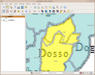
I want to fix the border between Loga and Dosso to better match the underlying raster. First up, activate the editing mode:

Now I hit a problem. Since polygon shapefiles are doubly-digitised, I couldn't see how to move the points on both polygonal boundaries together. And if I moved first one, and then the other, I would probably end up with slivers or polygons that didn't quite fit. I hit on another strategy.

First, select Loga region:

then use the 'Split Feature' tool to cut off a little bit of Loga in the corner away from the edge. This is just to keep the attributes of Loga somewhere, since in a second we're going to merge it with Dosso:

Now we have two features with the same attributes. It's possible that ID numbers have changed here, so don't rely on them. That might explain a bug to appear later... So now, select Dosso and the main part of Loga, and use the Merge Selected Features tool:

This pops up the dialog asking you where the merged feature should get its attributes from. In this case we want the feature to take the attributes of Dosso:

This leaves a few stray bits lying around on the border:

So use the Delete Ring tool to get rid of them:

Now we are going to split Dosso along the new border. First select it:

Then use the Split Feature tool to split by following the border on the underlying raster:

Here's the bug. It's labelled Dosso with 'Loga'. If you check the attribute table at this point it still says 'Dosso', so maybe everything is okay. We'll press on. What we do next is to select the two parts that will make up the new Loga in preparation for another 'Merge Selected Features':

We do the merge, and get the attributes from the little corner of Loga that we cut off earlier:

Now we have the geometry we want:

Except it's still labelled Dosso as Loga. The attribute table seems fine though - if I select Dosso the right line is highlighted in the attribute table:

Never mind, let's turn off the editing and see what happens:

Ooh! It's all looking good! Dosso is Dosso and Loga is Loga.

Now I hope there is an easier way of doing this - a way of editing points along common boundaries such that both polygons are modified. But I can't find it, and I've asked on #qgis and nobody seems to know. If not, then this might be the best way to do it!

Friday, 11 December 2009

Why Screencasts Can Suck

A screencast is an instructional video where you see someone's computer screen as they do something, together with a voice-over of them telling you what they are doing. Google trends shows them starting in 2006 and increasing in search volume ever since. Everyone wants to do a screencast.

But are they being used for the right thing? They have their place, just as a screwdriver is the right tool for putting in screws, but there seems to me to be a lot of people using them in the wrong place.

Here's a few reasons why they suck, together with fixes for ameliorating the suckage:
  • Speech and graphics aren't searchable in a browser or indexable in a search engine
    • Fix: include a transcript or at least a number of keywords and keyphrases on the page.
  • Video is hard to jump to a precise point. If I didn't follow a point, or I want to see how you set something up near the start, I'd like to be able to jump back and forth to key points. This also makes it hard to go through a screencast at your own pace.
    • Fix: I think YouTube videos can have chapter points. It may also be possible that screencasting software can give you some links for this. Include them.
    • Fix: Alternatively, overlay your screencast with big chunky step numbers or text in the corner. Then as I scroll the fiddly little control back I can see it change from (3) to (2).
  • Speech and text can't be cut and pasted. This is a pain with command-line videos, less so with gui clickage.
    • Fix: supply a text transcript of commands and speech where appropriate.
  • I'm listening to music.  The voiceover doesn't go with my tunes.
    • Fix: include subtitles. Also helps people with hearing difficulties, which will include me if I carry on listening to Muse at these volumes.
Those problems apply to all screencasts. Here are some things that make bad screencasts:
  • Loss of resolution. If you are squeezing your entire monitor onto a little YouTube video something is going to get lost. Zoom in if you need to show detail.
  • Two Many Misteaks. I don't want to see you mistyping things. Or going "oops". Or stuttering. Or forgetting something. Shout "cut" to yourself and do another take. Or do several takes and edit. Remember you only have to get this right once, thousands of people may have to watch it.
  • Nothing happening. Perhaps Andy Warhol would enjoy an unchanging screen with some rambling banter over the top. But I'm not sure everyone else does. This is supposed to be instructable, not minimalist.
Most of these problems can be worked round by creating a series of screenshots and annotating them. I've used Wink for this in the past. It creates a Flash file which you can either play or step through one stage at a time. You can add callout annotations and make the mouse cursor sparkle when it clicks something. The user can step back and forth.

It's extra work to do this, but then it's extra work to do a screencast properly with transcript, subtitles, or key point markers. Terse and precise text is much better than a rambling voice-over. Screencasts may be great for demonstrating anything that has lots of animation in it, but to demonstrate the operation of a piece of point-and-click software it has it's limitations.

Just sayin'.