So I'm modelling the H1N1 Swine Flu outbreak in Glasgow. One of the questions is how different regions (specifically 'datazones') within the study area interact with each other. You'd expect zones next to each other to interact with each other more than those on opposite sides of the city, for example. So our first idea is to use the distance between centroids as an explanatory variable and a distance-decay parameterisation for the effect. That works quite nicely.
But the real world isn't quite like that. Glasgow has a river running through it, splitting our study region into north and south parts. I wanted a new distance metric to reflect this partition.
So I came up with this idea - that the distance between two datazones is the minimum distance between the centroids of the graph formed by adjacent datazones.
First problem of that is computing the adjacencies between datazones. In R, I can just use poly2nb from the spdep package and get that. But I found that the graph created wasn't connected over the study region. Further investigation showed that polygons that clearly looked adjacent weren't being considered as adjacent. Here's a screenshot that shows three regions that look adjacent:
Now why wasn't poly2nb saying they were connected? I zoomed in for the answer:
Check the scale bar. These polygons are about a hundredth of a millimetre apart. That's a very tiny no-man's land. More like a "no-fly zone".
I figured I needed some kind of buffer on the polygons, and started looking into the rgeos package, recently released onto CRAN. It'll do that, and all sorts of things, but then when I tried working out adjacencies using its gIntersects function I discovered it worked to those tolerances already. By some magic the apparently adjacent regions were adjacent again.
However the graph was still not fully connected - it was composed of two subgraphs - the river is wide enough, and runs fully from east to west, that no fuzzy tolerances could really overlap the polygons. And that would probably be the wrong thing to do anyway.
So I loaded the regions into Quantum GIS and then loaded some Google Maps as underlays using the marvellous Google Maps plugin. I created a new vector layer of lines and started adding extra connections where bridges cross the Clyde:
These lines, shown in red above, were saved as a shapefile, then loaded into R and their start and endpoints overlaid on the datazones. That gave me some extra edges to add to the adjacency graph, all the graph stuff being handled by R's igraph package (including the distance-weighted minimum distance algorithm along adjacent datazones).
So now I have a completely-connected graph of datazones, which I can convert into a full distance matrix that reflects the geometry of the study region. The university's High-End Cluster is currently churning out the number for the model fit, and the results will hopefully be published in a journal sometime...
Thanks to: R, Quantum GIS, Google Maps plugin authors Ivan Mincik and Nungyao Lin, R package developers for sp, spdep, rgeos, igraph.
Friday, 25 March 2011
Wednesday, 22 December 2010
Mapping The Kendal Mint Quake
About 11pm last night my wall of photographs rattled. It's not unusual, it seems to happen whenever anyone is having a washing machine delivered and a truck crawls past my house. But a minute after that I was on the computer and someone local was tweeting about her house shaking. Earthquake? A few twitter searches revealed twitterers in Cumbria and North Lancashire had indeed experienced a small earthquake.
So I did what all statisticians would do - go looking for data. Tweets can be geo-coded, but getting reliable info might be hard. I checked the USGS earthquake site, but it's not real-time. But then I found the British Geological Society earthquakes page, with true real-time reports from a bunch of sensors around the country. Under the Monitoring menu there's the Real-Time Data option.
Here you can choose the station and a day and get a seismogram. Here's what the one in Keswick (KESW) was showing:
BIG spike. It went off the scale of the plot. I looked at a few other plots and discovered most of them had recorded it too. And I noticed the quake had hit at slightly different times. Maybe I could use that information to work out the location of the quake.
At this point the BGS site was getting slow as worried Cumbrians checked to see if it was an earthquake or if the local nuclear power station had exploded. Anyway, it was bedtime, so I left it to the morning, as something to do in my lunch hour.
I couldn't find a way to get the raw data, so I decided I'd get what I could from the images. A quick script pulled all the GIF images from the sites, except for a couple that seemed to be off-line. Another script pulled all the station information book HTML files and from there I got the locations.
I then stepped through each of the 24 images, identifying the point near 11pm where the tremors started, and entered the data.
Now I had the location and time of the points where the quake had been sensed. This was all converted to OSGB coordinates using rgdal in R.
I didn't have a zero-time for the quake or a location. A quick plot did show the quake had to be somewhere in Cumbria.
I don't know how professional seismologists work out earthquake epicentres, so I came up with something quick and dirty.
Assume the velocity of the quake waves are constant across the UK. Then if the quake was at location (x,y) then a plot of distance against time should be a straight line, with all the points on it. Some quick experiments showed I could fit a straight line then use the sum of the residuals squared as a measure to be minimised over (x,y). A few lines of code later and I had a coordinate!
By now the quake had hit the news and the USGS web site was showing it:
How did that compare to my point? I converted it to OSGB coordinates:
20km further east, and 6km south. Not bad considering I had to eyeball the time from the seismograms and various other assumptions. I don't know what kind of uncertainty the USGS put on their predictions, and I can't put an uncertainty on my location either since there's not a proper statistical model behind this. I can give you the data if you have a better idea - or you can scrape it again from the web site! Here's a comparison of the epicentre predictions on a map:
Here's what the distance/time plot looks like for my predicted epicentre:
And from the slope of this we can get the speed of travel of the quake waves - about 7,500 km/s - which is about what a quick google search on earthquakes tells me.
Footnote: I think on the bike home tonight I worked out a way to do this statistically. Suppose the earthquake is at (x,y), at time t0, and the waves move with speed v. Then suppose the time of arrival of the quake at a point at distance d is Normally distributed with mean time t0+d/v and variance k(d;theta), where k() is some increasing function of d. This allows us to consider the increasing noise in the system for points further away. Fit the whole thing by maximum likelihood and we get estimates (with errors) for location, time of origin, and wave speed. Something for next lunchtime...
So I did what all statisticians would do - go looking for data. Tweets can be geo-coded, but getting reliable info might be hard. I checked the USGS earthquake site, but it's not real-time. But then I found the British Geological Society earthquakes page, with true real-time reports from a bunch of sensors around the country. Under the Monitoring menu there's the Real-Time Data option.
Here you can choose the station and a day and get a seismogram. Here's what the one in Keswick (KESW) was showing:
BIG spike. It went off the scale of the plot. I looked at a few other plots and discovered most of them had recorded it too. And I noticed the quake had hit at slightly different times. Maybe I could use that information to work out the location of the quake.
At this point the BGS site was getting slow as worried Cumbrians checked to see if it was an earthquake or if the local nuclear power station had exploded. Anyway, it was bedtime, so I left it to the morning, as something to do in my lunch hour.
I couldn't find a way to get the raw data, so I decided I'd get what I could from the images. A quick script pulled all the GIF images from the sites, except for a couple that seemed to be off-line. Another script pulled all the station information book HTML files and from there I got the locations.
I then stepped through each of the 24 images, identifying the point near 11pm where the tremors started, and entered the data.
Now I had the location and time of the points where the quake had been sensed. This was all converted to OSGB coordinates using rgdal in R.
I didn't have a zero-time for the quake or a location. A quick plot did show the quake had to be somewhere in Cumbria.
I don't know how professional seismologists work out earthquake epicentres, so I came up with something quick and dirty.
Assume the velocity of the quake waves are constant across the UK. Then if the quake was at location (x,y) then a plot of distance against time should be a straight line, with all the points on it. Some quick experiments showed I could fit a straight line then use the sum of the residuals squared as a measure to be minimised over (x,y). A few lines of code later and I had a coordinate!
> fit$par [1] 307499.9 506035.7
By now the quake had hit the news and the USGS web site was showing it:
How did that compare to my point? I converted it to OSGB coordinates:
> coordinates(usgsos)
coords.x1 coords.x2
[1,] 328994.6 500054.7
20km further east, and 6km south. Not bad considering I had to eyeball the time from the seismograms and various other assumptions. I don't know what kind of uncertainty the USGS put on their predictions, and I can't put an uncertainty on my location either since there's not a proper statistical model behind this. I can give you the data if you have a better idea - or you can scrape it again from the web site! Here's a comparison of the epicentre predictions on a map:
Here's what the distance/time plot looks like for my predicted epicentre:
And from the slope of this we can get the speed of travel of the quake waves - about 7,500 km/s - which is about what a quick google search on earthquakes tells me.
Footnote: I think on the bike home tonight I worked out a way to do this statistically. Suppose the earthquake is at (x,y), at time t0, and the waves move with speed v. Then suppose the time of arrival of the quake at a point at distance d is Normally distributed with mean time t0+d/v and variance k(d;theta), where k() is some increasing function of d. This allows us to consider the increasing noise in the system for points further away. Fit the whole thing by maximum likelihood and we get estimates (with errors) for location, time of origin, and wave speed. Something for next lunchtime...
Tuesday, 21 December 2010
Speeding up some R Code
Part of my job involves looking at code written by research students and trying to make it do other things. Often a student is focused on their application area or particular dataset, and so the code and data are inextricably linked. Add another observation to the dataset and you'll find yourself having to change 3467 to 3468 in a dozen places. And maybe find some 6934s and change them to 6936s. The other problem is that research students are mostly new to serious programming, and so still need to develop both intuition and formal skills.
Today I've been working on such code for predicting epidemic outcomes. It was taking 14 seconds to run, which isn't too bad (especially considering some other work I'm doing takes 6 hours using OpenMP on an 8-core machine), but in my inspection I'd spotted some odd R code.
The oddity here is that var is one-dimensional and so is coef[1,]. This matrix multiply is really just something like exp(sum(var*coef[,1])). So I tried that, and the code took 6 times longer to run. Matrix multiplications are efficient in R, even in one dimension.
So I switched back to the original code. Time to get profiling. This is easy in R.
This told me most of the time was spent in the
I refactored the code to do
Note that at each stage I check that the new output is the same as the old output - it can be useful to write some little test functions at this point, but doing formal test-driven development can be a bit tricky for statistical applications in R.
There's still a bit of work to do to make this code a bit more general purpose. Currently it works on predictions for one particular country - we want to do predictions over half of Africa!
Today I've been working on such code for predicting epidemic outcomes. It was taking 14 seconds to run, which isn't too bad (especially considering some other work I'm doing takes 6 hours using OpenMP on an 8-core machine), but in my inspection I'd spotted some odd R code.
exp(var%*%t(coef[1,]))The oddity here is that var is one-dimensional and so is coef[1,]. This matrix multiply is really just something like exp(sum(var*coef[,1])). So I tried that, and the code took 6 times longer to run. Matrix multiplications are efficient in R, even in one dimension.
So I switched back to the original code. Time to get profiling. This is easy in R.
Rprof("run.out")
dostuff()
Rprof("")
summaryProfile("run.out")
This told me most of the time was spent in the
t function, within the function I was playing with earlier. Then I noticed that pretty much wherever coef was used, it was transposed with the t function.I refactored the code to do
t(coef) once, and then pass the transposed matrix around. That sped the code up from the original 14 seconds to 3 seconds. Sweet.Note that at each stage I check that the new output is the same as the old output - it can be useful to write some little test functions at this point, but doing formal test-driven development can be a bit tricky for statistical applications in R.
There's still a bit of work to do to make this code a bit more general purpose. Currently it works on predictions for one particular country - we want to do predictions over half of Africa!
Tuesday, 7 September 2010
A queue in R
Recently someone asked on the R-help mailing list if there was an implementation of a queue in R. I had a quick look (which the poster should have done anyway) and all I could find was an implementation in the filehash package that used database file storage.
I figured it couldn't be that hard to implement just by sticking things on one end of a list and taking them off the other, so I wrote one between having breakfast and setting off late for work.
This evening I polished it off a bit, and even added logging so you could see how big your queue had grown.
The code is available for download under a CC license from my Maths and Stats web pages.
If anyone wants to add this to a package or make a package of it, let me know and I'll help you write a stack and a deque too.
Friday, 28 May 2010
gvSIG, I want to love you...
I've just been proofreading an article on gvSIG for the next OSgeo Journal (Volume 6, coming to an HTTP server near you soon). And I so want to love it. The author claims it does everything for him. I want it to do everything for me too.
Currently I use QGis for my day-to-day GIS operations. But the limitations are there - mostly in the geoprocessing arena. Vector and raster operations are a bit fragile and buggy at the moment, mostly because they are fairly new to QGis. A grand effort by Carson Farmer et al has greatly increased the analytical capabilities of QGis but there is still a way to go. Meanwhile gvSIG, with the Sextante toolbox, has it all. At least in theory. Time for me to try it out again.
So, off to the web site, and download the latest version. Its a Java app, and I keep getting bitten by incompatible Java environments so I downloaded the version for Linux with the included JRE. It's a big .bin file, so once downloaded you chmod it executable and run it. Choose an install directory and components, and there it goes. All ready to run.
First thing I notice is that the java environment doesn't resize properly. No matter how I stretch or refresh the window, the blue desktop remains fixed size. The grey area is unusable:
Oh well never mind, let's have a look at the interface:
yes, well peace to you too. This menu has one option concerning DBF file encodings. I went 'huh?' and tried something else. Let's load a shapefile.
First you have to create a new "View", so click on the View icon and there's a new view. Double-click or hit 'open'. Now, how to load that shapefile?
Ah, the menu bar has changed. Okay, let's hunt. Layer? No, not there. Shalom? Nope. File? Nope. Oh, it's under View then Add Layer. That's not a standard place for adding things. Usually the View menu is for stuff like zooming in and out. Oh well.
At least now I've got the option. Hit it!
Yeah. Blank. There's controls in there, since random clicking does things. But I see nothing. Oh well, let's quit and try something else:
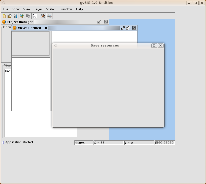
Blank again. Most of the dialogs are blank, including Help. There's no obvious errors on the console either. I have to hit Ctrl-C to kill it.
Normally I blame these problems with java apps on JRE incompatibilities, but I have no idea what is going on here. I'm running on Ubuntu Karmic on a PC and everything else works nicely. Obviously something is messing up gvSIG since plenty of other people must be using it. Ideas welcome. I think my next step is to try it with a new clean username. But that shouldn't be necessary in this day and age...
Monday, 3 May 2010
Medical Research Council grant success!
Back in October I talked about a grant proposal we'd put in to fund some research into disease surveillance. Well, a few weeks ago we heard that our application was successful! So that's nearly half a million pounds coming our way. It'll pay a large chunk of my salary for three years, a smaller chunk of the Prof, and a whole research associate. There's also money for new toys and travel to Africa, the USA and various conferences.
So if anyone with strong statistical skills in R is interested in a research project involving spatial and temporal statistics in epidemic prediction, get in touch and I'll send you some details. Probably starting in September.
Sunday, 2 May 2010
Culture Colours and Infographics
A graphic from the Information Is Beautiful blog has been doing the rounds lately. I first saw it on Apartment Therapy and decided to have a little grumble about it. Then it got some coverage on the Junk Charts blog. I decided to get the raw data and see what it looked like in a more informative presentation.
But how to get the raw data? There's no link to it I could find. So I decided to scrape it.
First, I found the highest resolution image of it I could find on the web. Wasn't massive, but it would do. Then I could load it into R using readGDAL from the rgdal package:
co=readGDAL("image.png")
image(co,red=1,green=2,blue=3)
and there it is in my R graphics window. Now I need to generate a whole bunch of circular points where I want to sample the colours. So out with the sines and cosines. Lots of trial and error getting the radii right for all ten sections, but eventually I had it. It was a seconds work with the overlay function from the sp package to get the 860 colour points.
860? There's only 84 traits? I found and dropped the two rows that corresponded to the A-J index and the J-A index. Now I had all the colours in a nice matrix which I could save to a file for safe keeping.
For a simple presentation, I just created an HTML table where the cell background was the colour. It's hard to do rotated column headers in HTML, so I added a fixed DIVas index, and multiple row headers so you can always see the column heading letters. I think the resulting HTML page makes it much easier to navigate and find the colour for the thing you are looking for, although nobody will want to buy large-format version posters of it.
If anyone wants the raw data, drop me an email.
But how to get the raw data? There's no link to it I could find. So I decided to scrape it.
First, I found the highest resolution image of it I could find on the web. Wasn't massive, but it would do. Then I could load it into R using readGDAL from the rgdal package:
co=readGDAL("image.png")
image(co,red=1,green=2,blue=3)
and there it is in my R graphics window. Now I need to generate a whole bunch of circular points where I want to sample the colours. So out with the sines and cosines. Lots of trial and error getting the radii right for all ten sections, but eventually I had it. It was a seconds work with the overlay function from the sp package to get the 860 colour points.
860? There's only 84 traits? I found and dropped the two rows that corresponded to the A-J index and the J-A index. Now I had all the colours in a nice matrix which I could save to a file for safe keeping.
For a simple presentation, I just created an HTML table where the cell background was the colour. It's hard to do rotated column headers in HTML, so I added a fixed DIVas index, and multiple row headers so you can always see the column heading letters. I think the resulting HTML page makes it much easier to navigate and find the colour for the thing you are looking for, although nobody will want to buy large-format version posters of it.
If anyone wants the raw data, drop me an email.
Subscribe to:
Posts (Atom)