Friday, 28 May 2010

gvSIG, I want to love you...

I've just been proofreading an article on gvSIG for the next OSgeo Journal (Volume 6, coming to an HTTP server near you soon). And I so want to love it. The author claims it does everything for him. I want it to do everything for me too.

Currently I use QGis for my day-to-day GIS operations. But the limitations are there - mostly in the geoprocessing arena. Vector and raster operations are a bit fragile and buggy at the moment, mostly because they are fairly new to QGis. A grand effort by Carson Farmer et al has greatly increased the analytical capabilities of QGis but there is still a way to go. Meanwhile gvSIG, with the Sextante toolbox, has it all. At least in theory. Time for me to try it out again.

So, off to the web site, and download the latest version. Its a Java app, and I keep getting bitten by incompatible Java environments so I downloaded the version for Linux with the included JRE. It's a big .bin file, so once downloaded you chmod it executable and run it. Choose an install directory and components, and there it goes. All ready to run. 

First thing I notice is that the java environment doesn't resize properly. No matter how I stretch or refresh the window, the blue desktop remains fixed size. The grey area is unusable:


Oh well never mind, let's have a look at the interface:
yes, well peace to you too. This menu has one option concerning DBF file encodings. I went 'huh?' and tried something else. Let's load a shapefile.

First you have to create a new "View", so click on the View icon and there's a new view. Double-click or hit 'open'. Now, how to load that shapefile?

Ah, the menu bar has changed. Okay, let's hunt. Layer? No, not there. Shalom? Nope. File? Nope. Oh, it's under View then Add Layer. That's not a standard place for adding things. Usually the View menu is for stuff like zooming in and out. Oh well.
At least now I've got the option. Hit it!
Yeah. Blank. There's controls in there, since random clicking does things. But I see nothing. Oh well, let's quit and try something else:
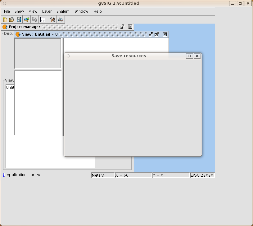
Blank again. Most of the dialogs are blank, including Help. There's no obvious errors on the console either. I have to hit Ctrl-C to kill it.

Normally I blame these problems with java apps on JRE incompatibilities, but I have no idea what is going on here. I'm running on Ubuntu Karmic on a PC and everything else works nicely. Obviously something is messing up gvSIG since plenty of other people must be using it. Ideas welcome. I think my next step is to try it with a new clean username. But that shouldn't be necessary in this day and age...


Monday, 3 May 2010

Medical Research Council grant success!

Back in October I talked about a grant proposal we'd put in to fund some research into disease surveillance. Well, a few weeks ago we heard that our application was successful! So that's nearly half a million pounds coming our way. It'll pay a large chunk of my salary for three years, a smaller chunk of the Prof, and a whole research associate. There's also money for new toys and travel to Africa, the USA and various conferences.

So if anyone with strong statistical skills in R is interested in a research project involving spatial and temporal statistics in epidemic prediction, get in touch and I'll send you some details. Probably starting in September.

Sunday, 2 May 2010

Culture Colours and Infographics

A graphic from the Information Is Beautiful blog has been doing the rounds lately. I first saw it on Apartment Therapy and decided to have a little grumble about it. Then it got some coverage on the Junk Charts blog. I decided to get the raw data and see what it looked like in a more informative presentation.

But how to get the raw data? There's no link to it I could find. So I decided to scrape it.

First, I found the highest resolution image of it I could find on the web. Wasn't massive, but it would do. Then I could load it into R using readGDAL from the rgdal package:

co=readGDAL("image.png")
image(co,red=1,green=2,blue=3)

and there it is in my R graphics window. Now I need to generate a whole bunch of circular points where I want to sample the colours. So out with the sines and cosines. Lots of trial and error getting the radii right for all ten sections, but eventually I had it. It was a seconds work with the overlay function from the sp package to get the 860 colour points.

860? There's only 84 traits? I found and dropped the two rows that corresponded to the A-J index and the J-A index. Now I had all the colours in a nice matrix which I could save to a file for safe keeping.

For a simple presentation, I just created an HTML table where the cell background was the colour. It's hard to do rotated column headers in HTML, so I added a fixed DIVas index, and multiple row headers so you can always see the column heading letters. I think the resulting HTML page makes it much easier to navigate and find the colour for the thing you are looking for, although nobody will want to buy large-format version posters of it.


If anyone wants the raw data, drop me an email.

Friday, 12 March 2010

Twitter Timeline Visualisations

Ever wanted to make scrolling timeline visualisations of tweets?

Here's how.

You will need:

  • The R environment for statistics and graphics (www.r-project.org)
  • The twitteR and brew packages for R
  • Some web space
 I'm using the MIT Simile Timeline widget to do all the hard work. All I need to do is get the tweets into the right format. To do that I wrote a little R program using the twitteR package to access tweets via the search API, and the brew package to reformat into XML. Here's my entire twitline function:

twitline <- function(q,outfile,num=15,...){
require(twitteR)
require(brew)
srch=searchTwitter(q,num=num,...)
brewSrc="

<% for(tweet in srch){ %>\
\"
title=\"<%=screenName(tweet) %>\">
<%=text(tweet) %>

<% } %>

"
brew(text=brewSrc,output=outfile)
}
Now all I do is: twitline("sea otters","twitter.xml",num=100) and I get an XML file in the right format. Read the timeline docs and you'll see that all you need is:

Timeline.loadXML("twitter.xml", function(xml, url) { eventSource.loadXML(xml, url); });
 in the right place in your javascript.

There's a few things need doing here, like scaling the timeline to the events on startup, maybe styling things a bit better, having a way to get more than 100 tweets, linking to twitter.com and so on. Consider it a start.

Also, the grabbing and conversion could easily be done in Python or [IYFPLH]. Even cooler would be on-the-fly updates. Check out the SIMILE docs for more ideas.

Barry

Thursday, 11 March 2010

Fun With OpenLayers and Flot

OpenLayers is a javascript library for doing client-side maps. Flot is a javascript library for doing charts. Put them together and what have you got?

A system for dynamic interactive spatio-temporal graphics. It's something I've wanted to play with for a while, and now I had an excuse. Our meningitis data from Africa is exactly that - counts of meningitis cases in areas in time periods. Eventually we'll be getting it in real time, and predicting epidemics. But for now everything is simulated data.

What I wanted was a map of our country of interest (in this example, Niger). Clicking on the regions of Niger would show a time-series plot of the case count history for those regions. Flot can happily show multiple line charts, show dates on the X-axis, adjust its axes automatically, colour-code it's lines and so on.

So I started with an OpenLayers map and read in my Health District GML file. That's my spatial data. Then I read in a JSON file using JQuery's AJAX api. That's my time-series data (one time series per region). I create a new plot object with Flotr, initially empty.

 Adding a SelectControl to the map lets you hook into clicks and hovers on the regions. Each click toggles a region on or off, and when toggled on the corresponding time-series is added to the Flotr plot. Toggle a region off and the time-series line is removed. Flot takes care of updating the legend and the axes.

 The Flot charts get a bit cluttered with a dozen lines, so I decided to restrict the number of selected regions to ten. If the user tries to select an eleventh, the system doesn't let you. You have to deselect another region first. This was all done in the onSelect action of the controller. I should probably also make it display a message at this point.

 I also decided to match the line colour on the chart with the area colour on the map. I generated a palette of colours from ColorBrewer and used those. When an area is selected a colour is popped from the palette and used to style the area and the line. When an area is deselected its colour is pushed back onto the array.

After fixing some dangling commas and a few other annoyances it even worked on Internet Explorer.

A plain demo is available, which possibly needs a bit of tweaking to make good. It doesn't have the styling of the above image, but does work in IE and lets you see how it all works.

You may use my javascript code in linkedmap.js freely. The map data is an approximate digitisation from a low-resolution image, so does not accurately represent the areas in Niger. All count data is simulated.

Tuesday, 2 February 2010

The great British Library DRM Flip-flop

Our tech support helpdesk recently received requests from a PhD student and a member of staff to install something they needed to read documents requested from the British Library. A proprietary Adobe system called 'ADEPT' was being used to prevent copying and distribution of papers requested from the BL's loan system.

Problem number one was that our PhD students, like many scientists, are enlightened enough to use Linux. There is no Linux version of ADEPT. Apparently Adobe promised one a year or so ago, but that promise disappeared from their web page. Now there's no plans for it. Thanks.

 I emailed BL customer service about this. Explaining both how DRM was a stupid idea and DRM with no Linux version was a dumb stupid idea. But not in those terms, of course. The customer services response was fun. First they said:

"It is unfortunate that your student has problems receiving documents in an elecronic format."

My response was that misfortune had nothing to do with it, but poor decisions on content-delivery did. They went on:

"We supply articles via Secure Electronic Delivery as customers want to receive them electronically." 

 Yup, we all love saving trees. 

"The need for encrypted documents is due to the current agreement the British Library has with publishers"

 Encrypted? Here's my GPG Public Key if you want to encrypt documents. I explained how this was not encryption, this was DRM, and was hence doomed to failure. At some point any DRM system has to let the user read the file, or hear the music, or see the movie, and at that point it is clear that any encryption has been decrypted. At that point the user has had, somehow, the decryption key. DRM is just obfuscation of encryption keys. Find the encryption keys and you can bypass the DRM.

And that has been done. There is published on the web a couple of quite short python scripts for bypassing ADEPT DRM. One gets the decryption key. From my reading of the code it seems to be stored in the Windows registry and mashed together with your PC's CPU identifier to tie it to your hardware. So you need an official ADEPT account and all that. 

Once that script has got the key, you run the second script on any DRMd files, using the recovered key to produce an unencumbered document (PDF file, usually). This you can print, copy to your laptop, backup and know the backup will be readable in whatever PC you have in ten years time, run through ps2text to create plain text and so on. All the things you'd love to do, and are probably legal, if you had a real copy in the first place.

Customer service went on:

"Your student may find it helpful to contact your University Library as they may be able to help by receiving and printing the documents for her. We also still supply Xerox copies by post."

 Tiiiiiimmmmmmberrrrrrrrrrrrrrrrrrrrrrrrrrrrrrrrr!!!!!!

 The great mystery is how the BL's policy has changed in the last four years. I found this quote from a news website:

 [The] British Library when speaking to the All Parliamentary Internet Group in 2006, warned that the adoption of DRM technology would "fundamentally threaten the longstanding and accepted concepts of fair dealing and library privilege and undermine, or even prevent, legitimate public good access.
 
 *sigh*

Monday, 4 January 2010

Generating Fake Geographies

The other day I asked a question on the R-sig-geo mailing list. How can I generate a set of polygons that look a bit like a real set of districts or other subdivisions? Here's what I came up with:
  1. Take a set of points
  2. Generate the voronoi tiles of the points
  3. Turn the straight-line edges into something wiggly
  4. Clip or cut the resulting polygons
So I wrote some R code to do all this. 1 and 2 are pretty easy using the tripack package to generate the voronoi tiles. Making the edges wiggly is a bit trickier. I implemented a fractal algorithm. Split the edge into two pieces by making a new point somewhere near the centre of the edge. Then repeat for the two pieces to make four pieces. Do this three times. This should make a fairly straight wiggly line. For clipping and cutting the polygons I used the gpclib package (free for non-commercial use only - read the license).

 Clipping and cutting is necessary because voronoi tiles can extend way beyond the initial points if the tile edges are nearly parallel. I implemented four clipping modes:
  • No clipping (so you get the full polygons)
  • Include polygons that overlap a given boundary polygon
  • Clip polygons to given boundary polygon
  • Include only polygons completely inside a boundary polygon
 By default the boundary polygon is the convex hull of the input points, but you can specify another polygon for clipping.

Here's my sample data - some points and a blue polygon for clipping:

Here's a fake geography created using these points and clipmode zero - the blue polygon is ignored here:

Note that the polygons bottom left head off some distance south-west. The lack of polygons in the north and west is due to these areas being infinite. They don't form closed tiles. This means the number of polygons you get returned wont be the same as the number of input points.

The wiggling algorithm here may cause lines to cross and overlap. There's no test for that at the moment.

Clipmode 1 only includes polygons that are partly or wholly inside the clip polygon:

This has eliminated all the extending polygons in the south-west. Mode 2 clipping results in the polygons being clipped to the boundary polygon. This is useful if you are creating a set of polygon districts within an existing area such as a country boundary:

Note you can't see the red edges under the blue polygon boundary here - they are there though.

Mode 3 only returns polygons wholly inside the clip polygon:

This only leaves 8 polygons - it looks like one polygon on the inner corner has just been clipped out.

So there it is. I've not polished up the code yet, but it's pretty short and sweet. Interested? Let me know.


Addendum: I promise I'll bundle the code up shortly, but today I've been making tweaks to produce fake river networks:


It's pretty much the same basic procedure - generate a voronoi tiling and wiggle the edges. Then compute a minimum spanning tree (any tree will probably do) with distance as the weight. The resulting map looks a bit like a river network (although I wouldn't want to draw the contours or DEM it came from).

I tried various weighting schemes for the MST. Using distance means it uses up the small edges before the large edges, which tends to leave those big gaps that could be mountain ridges.

Other ideas welcome!